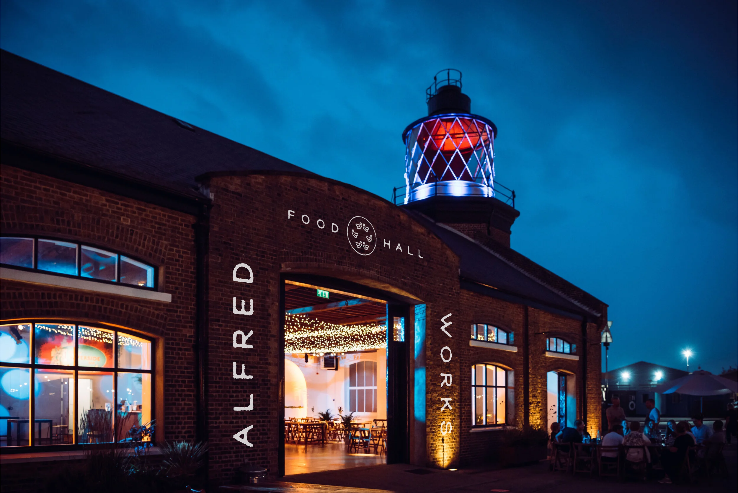
Take Your Tastbuds on a Trip
Branding for a new food hall launching in the former factory floor of the Bird’s Custard Factory. To add a nod to this I chose to name the venue Alfred Works - derived from the original founder of the factory, Alfred Bird.
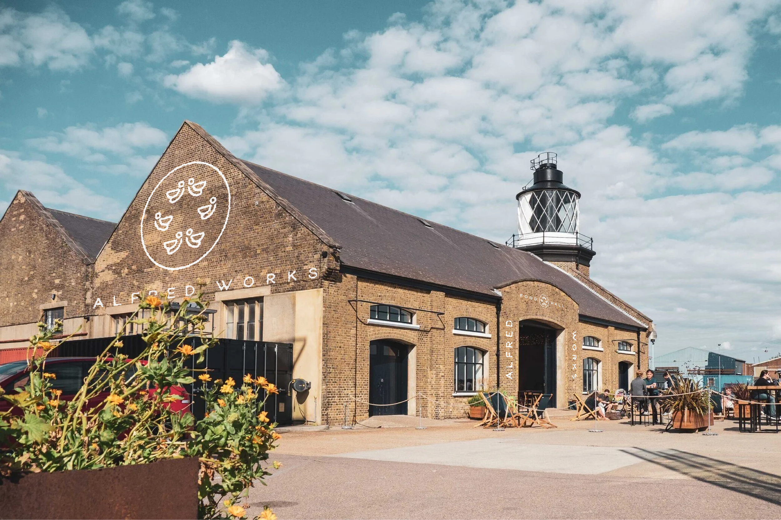
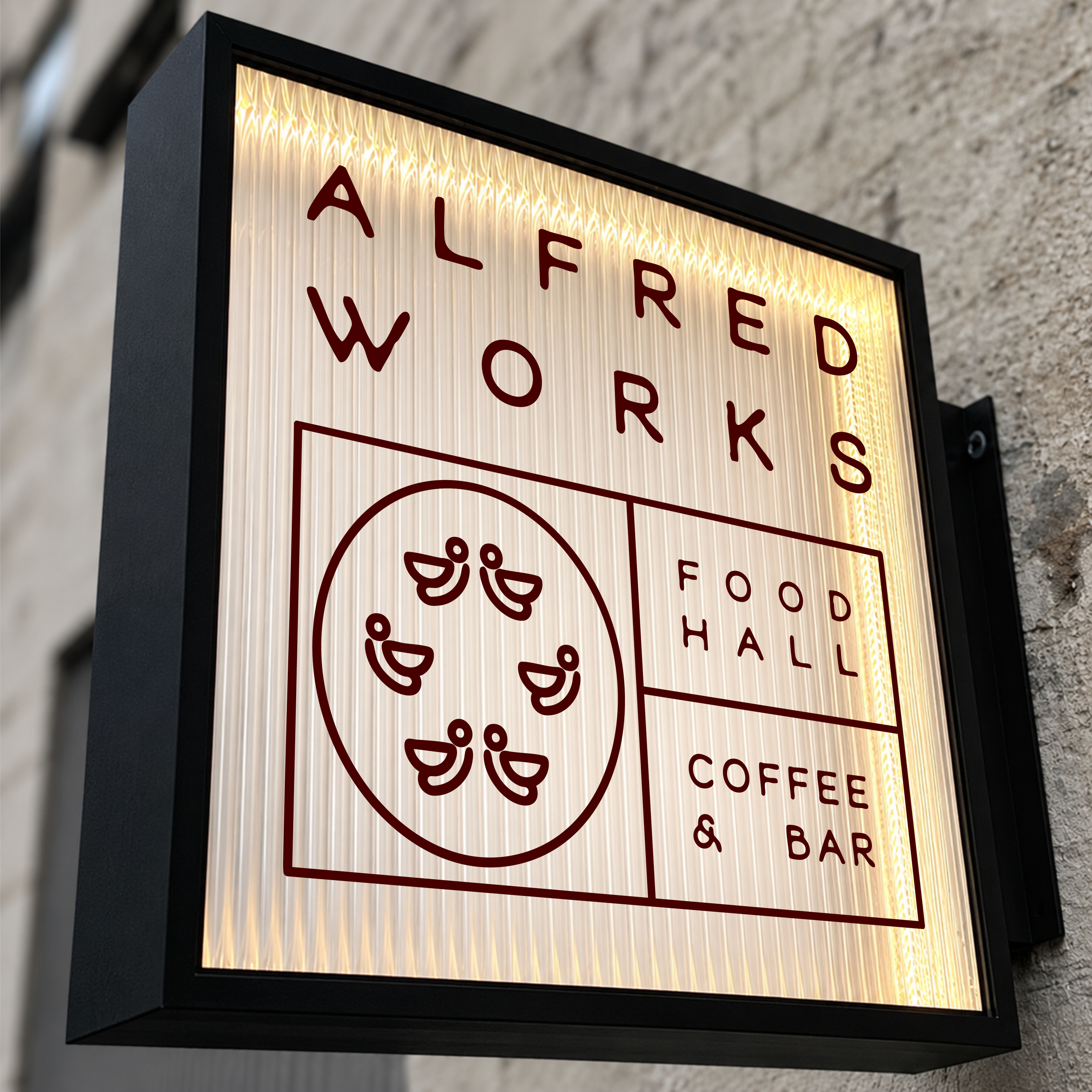
To build on the brand story and further reference the history of the space, the logo features abstract characters shifting around in all directions - representing both the workers on the old factory floor and the bustling atmosphere of the venue full of guests in the present day.
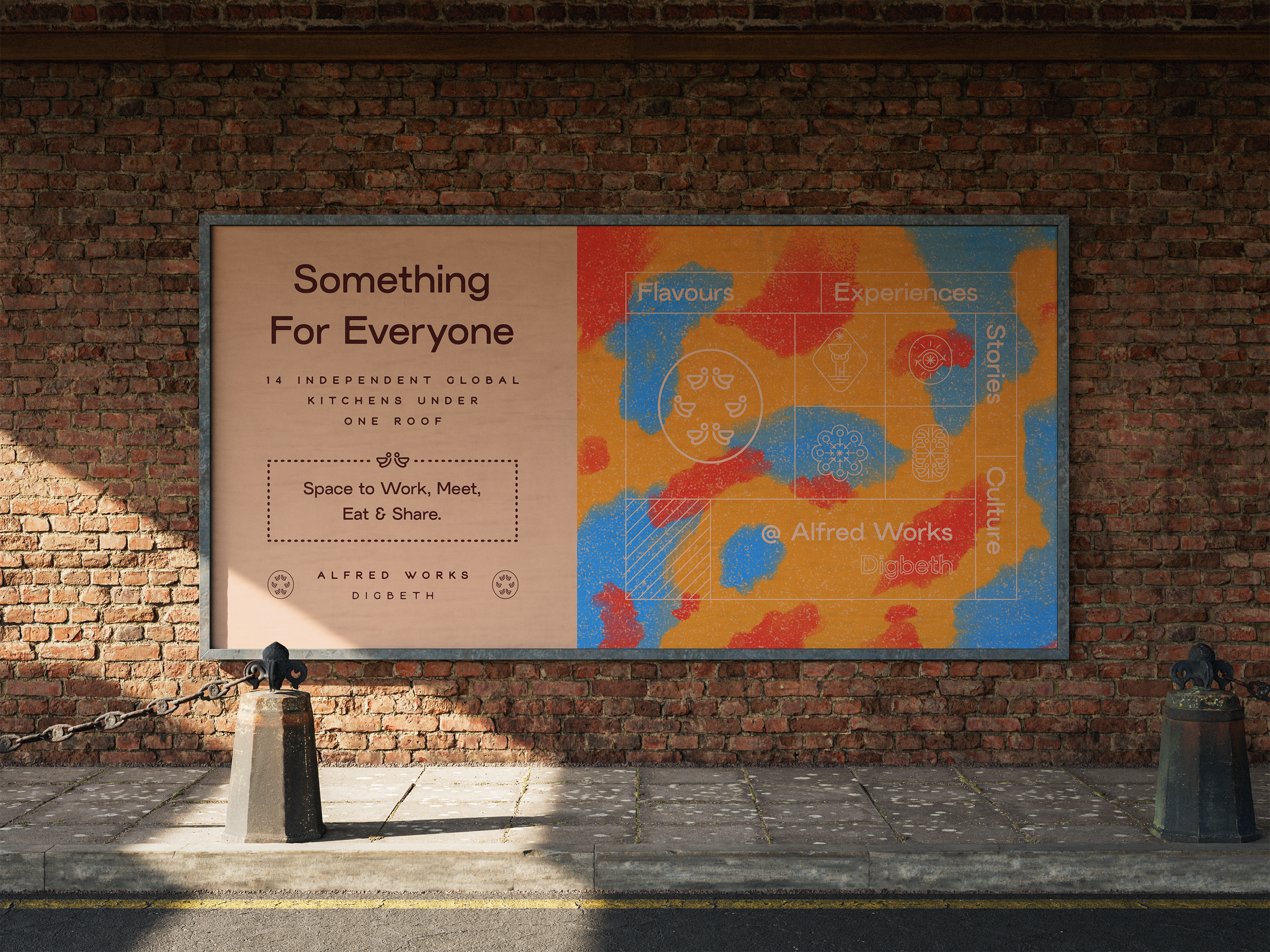
The key message to deliver in the launch campaign was the range of cuisines on offer in one space. However it was important to broadcast that the venue would operate as a community hub, offering much more to visitors than just food.
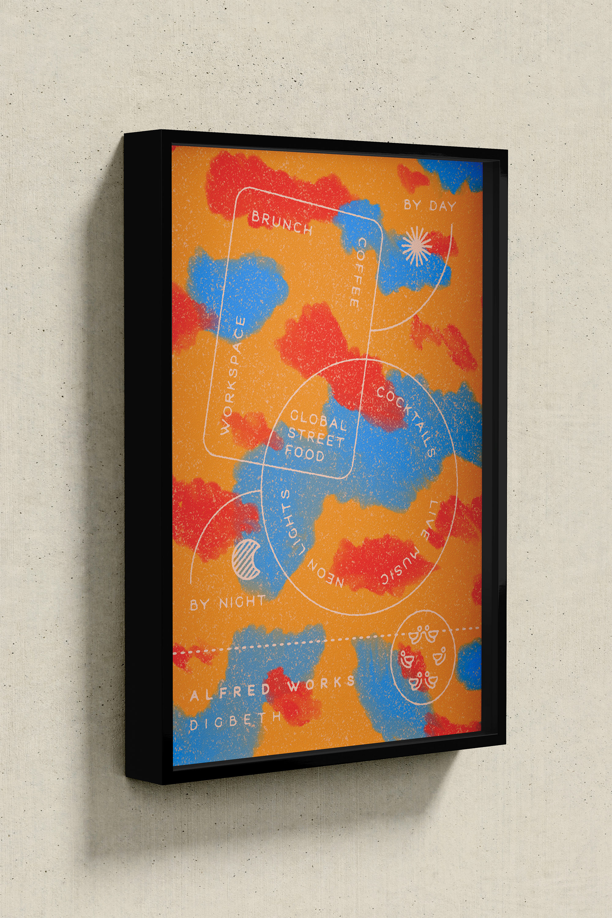
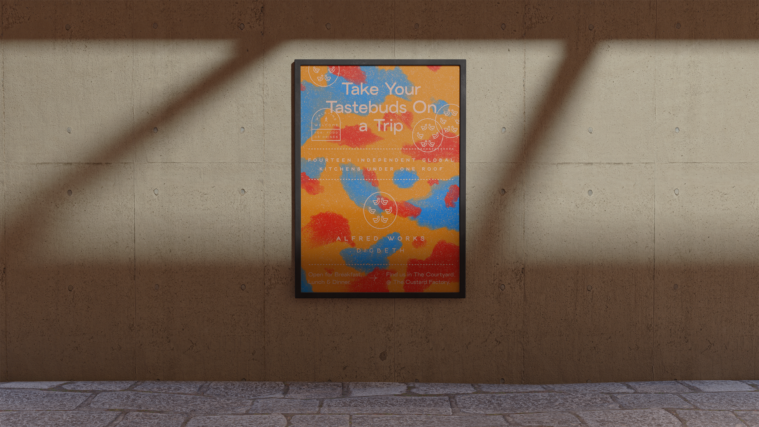
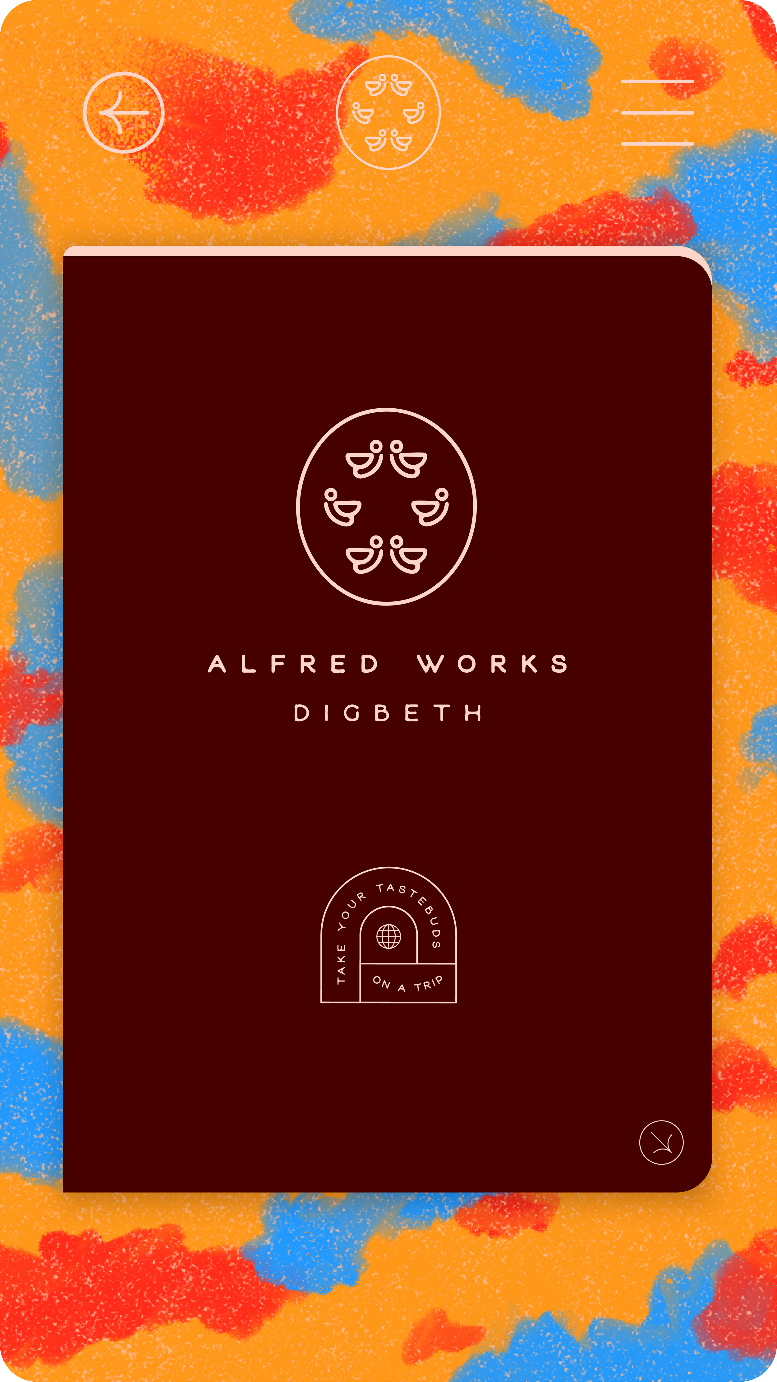
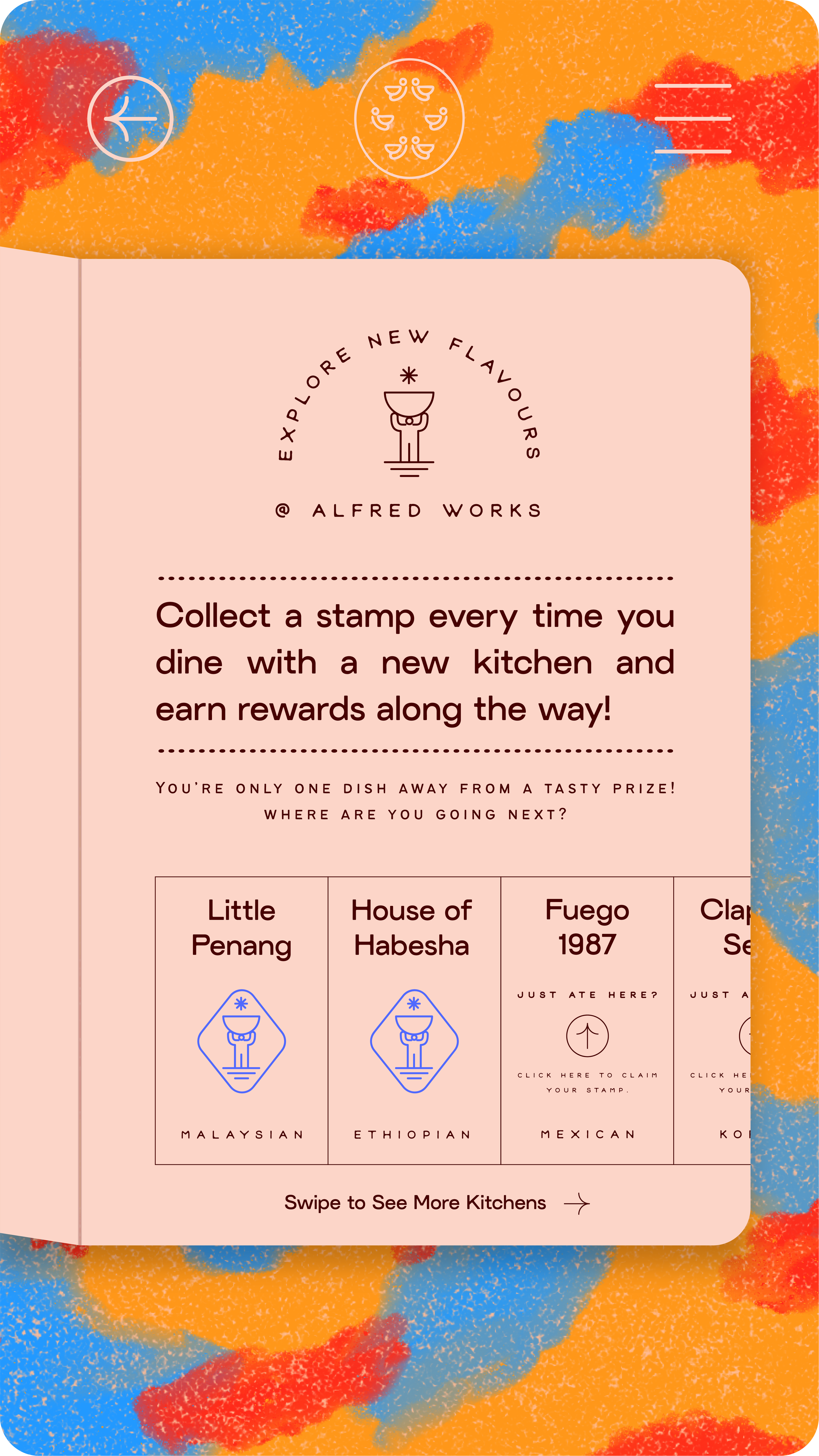
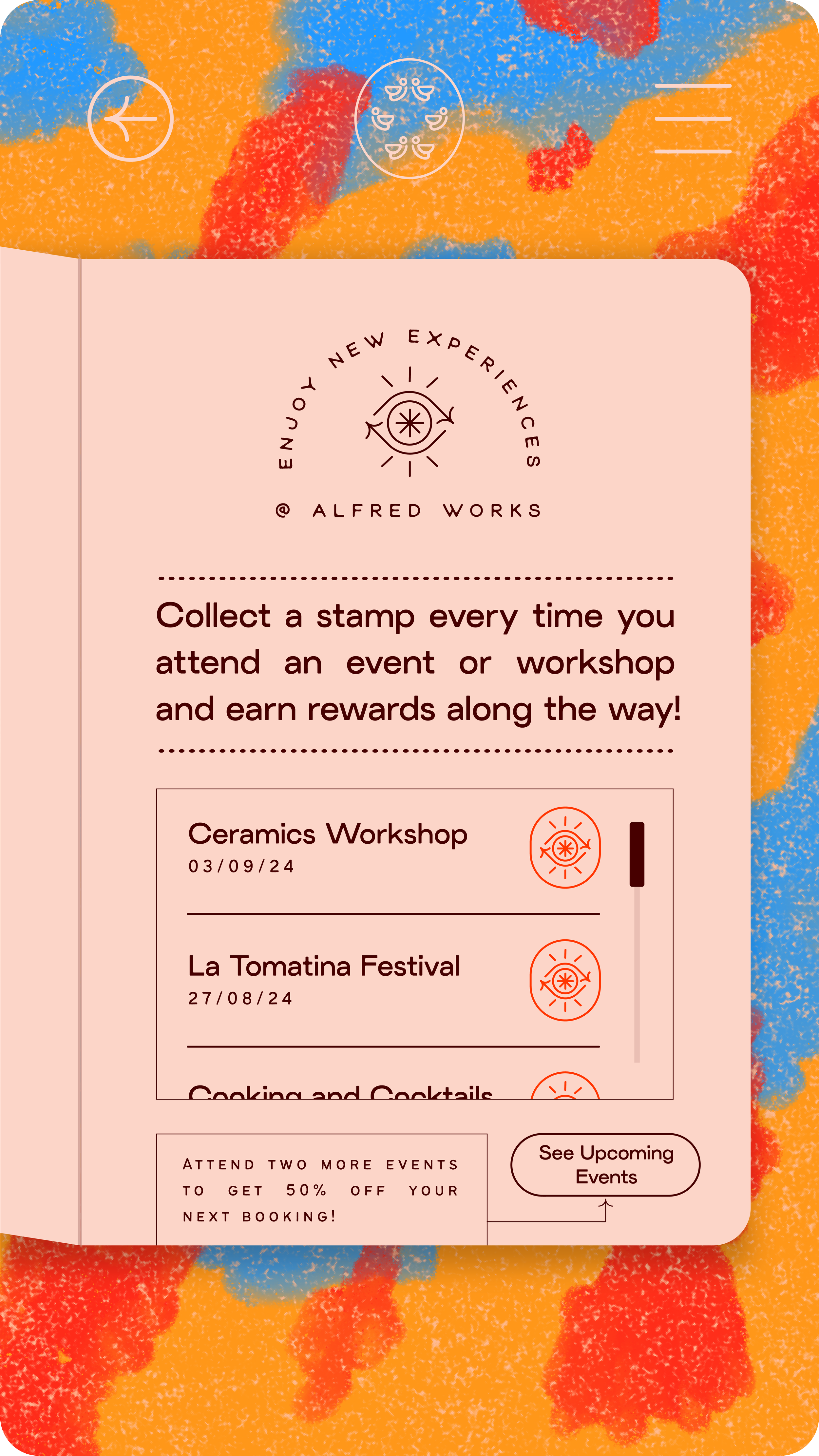
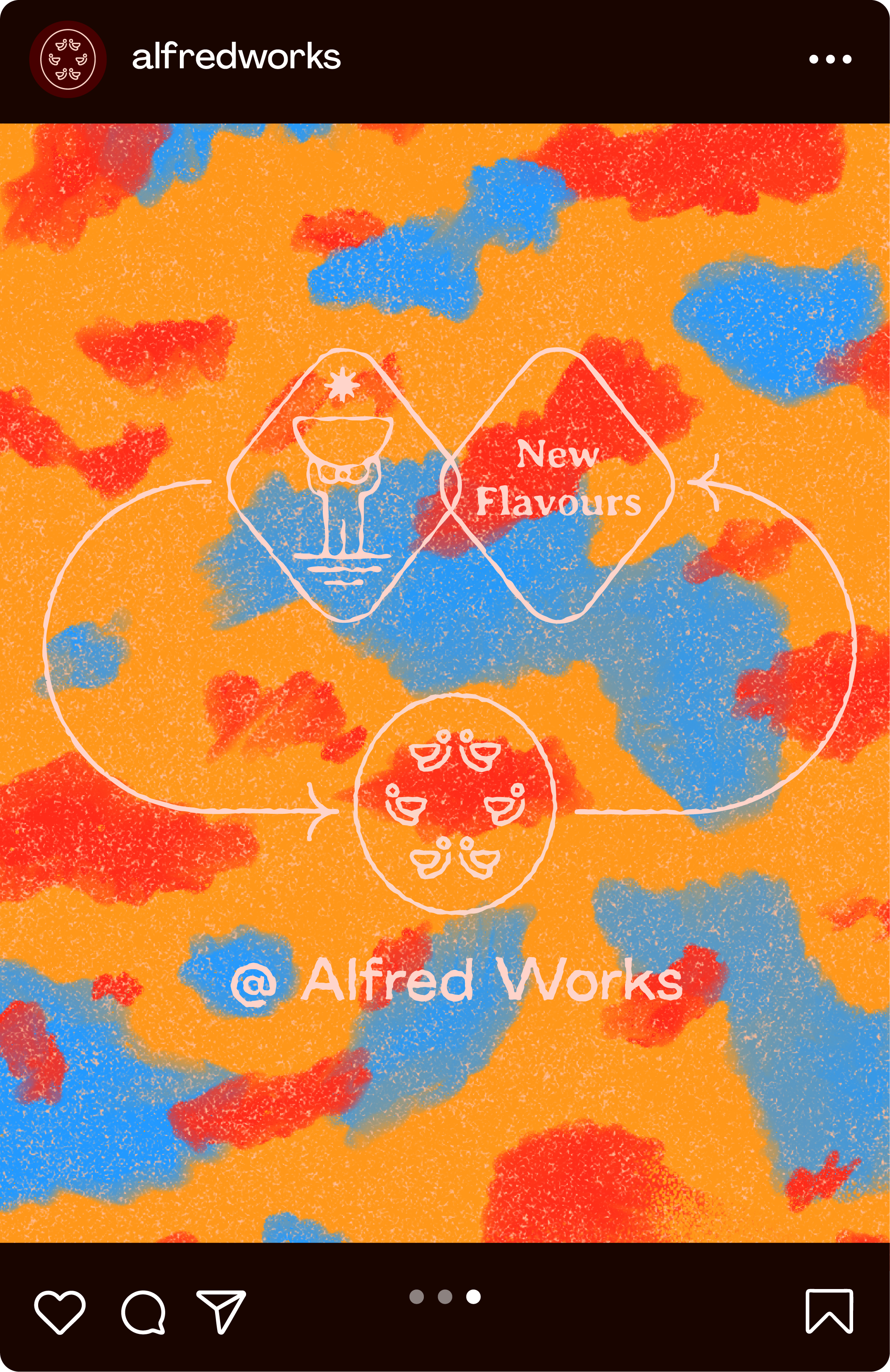
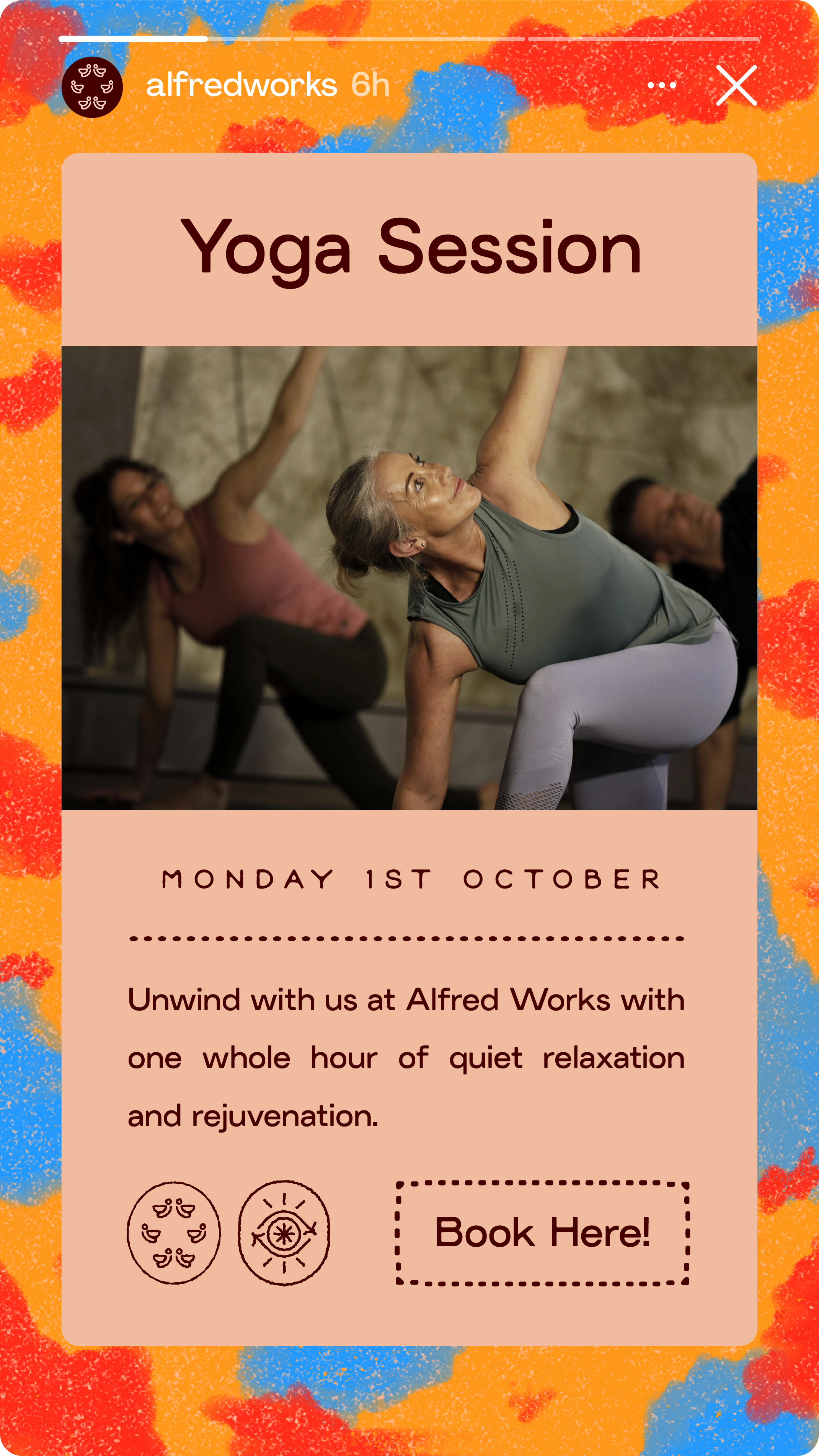
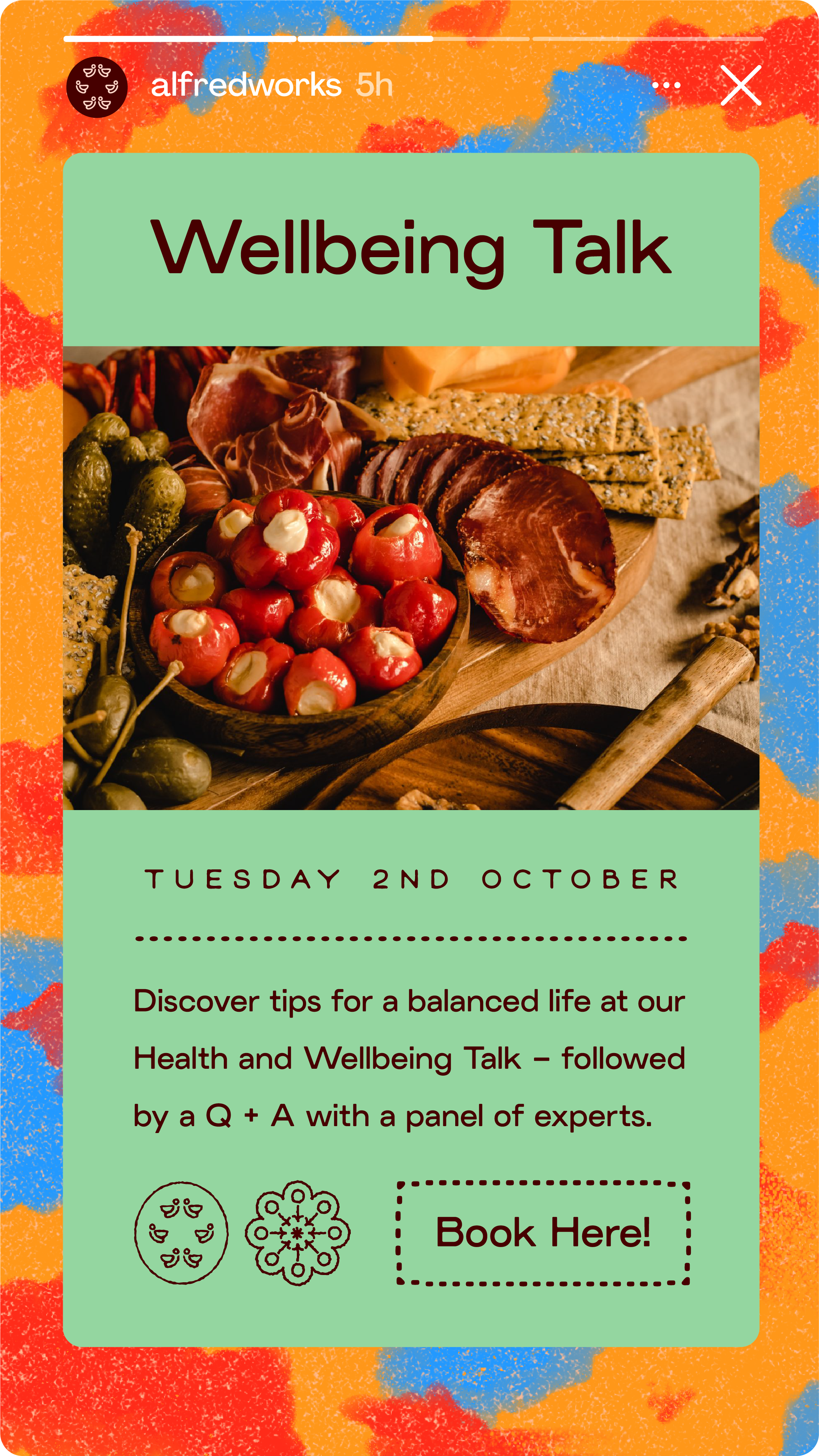
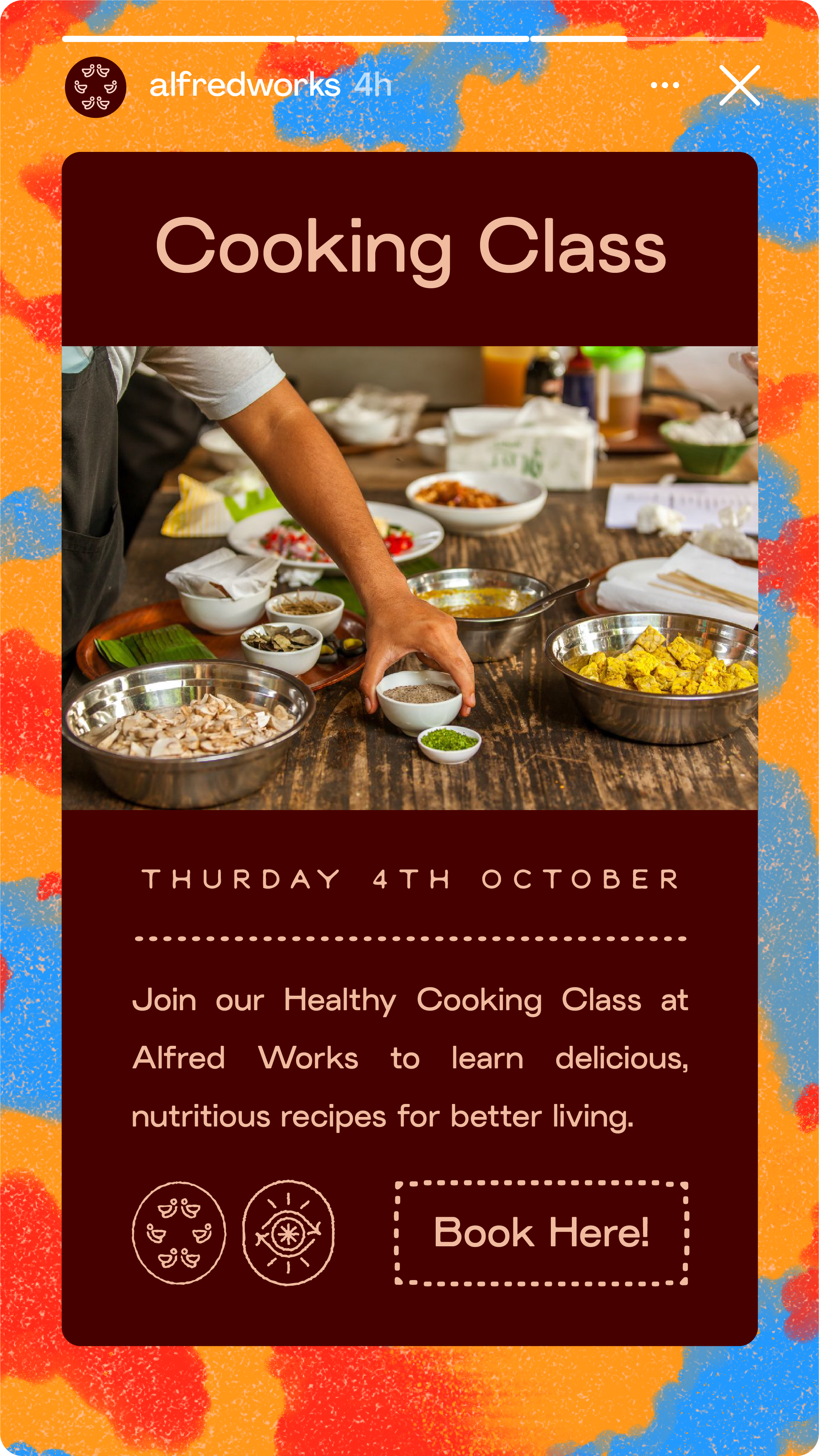
When it came to the visuals I wanted to project a sense of both the warmth and the flavour that guests would experience inside the venue. The first building block being bold, fuzzy backdrops that take inspiration from the iconic colour scheme of Bird’s products. All info is presented in slick, tidy layouts to offset the more chaotic composition of the backdrops striking a balance between fun and well-run.
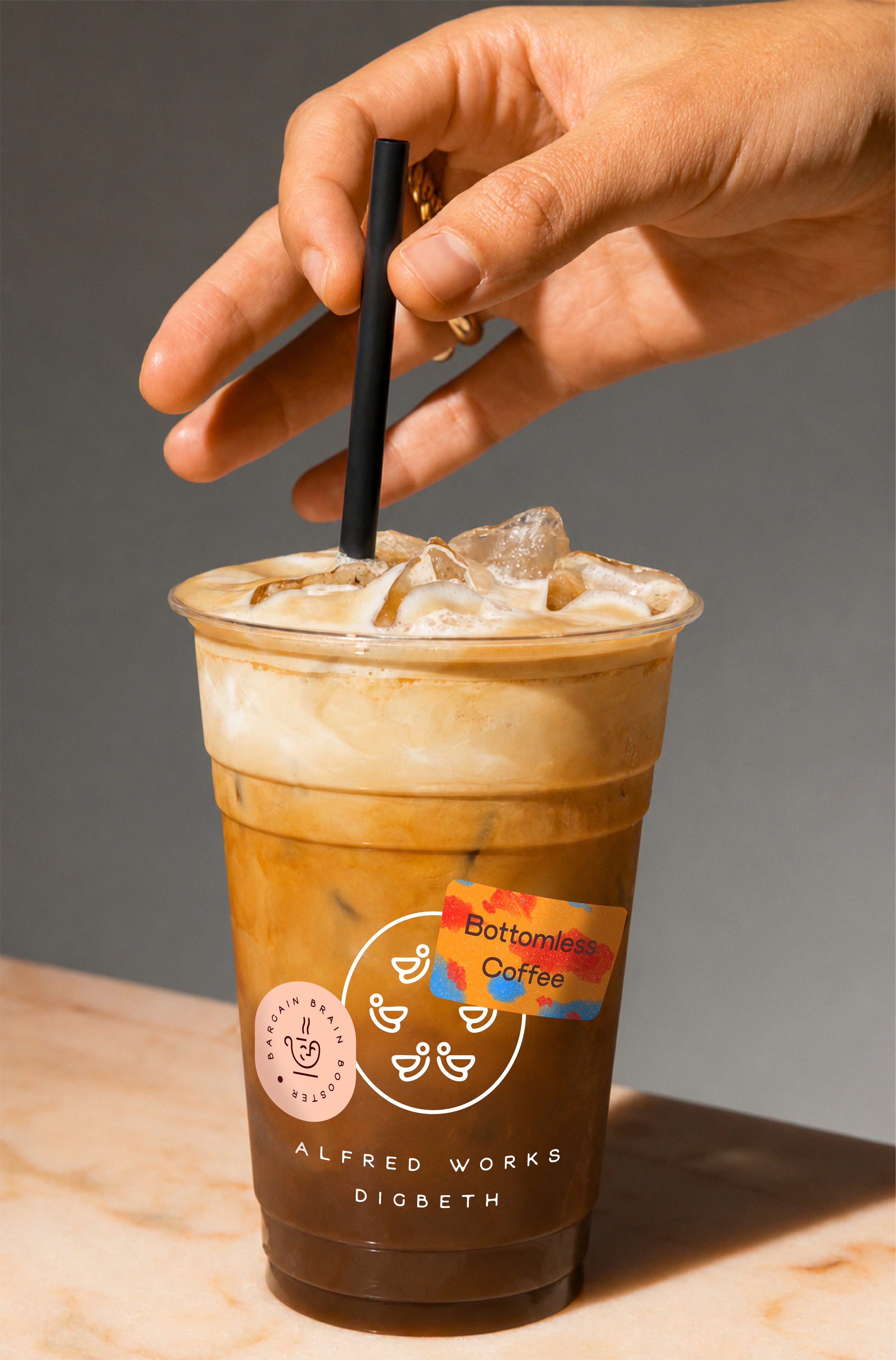
A series of icons were created to represent key aspects of the experience available to guests, highlighting the multi-purpose nature of the venue.
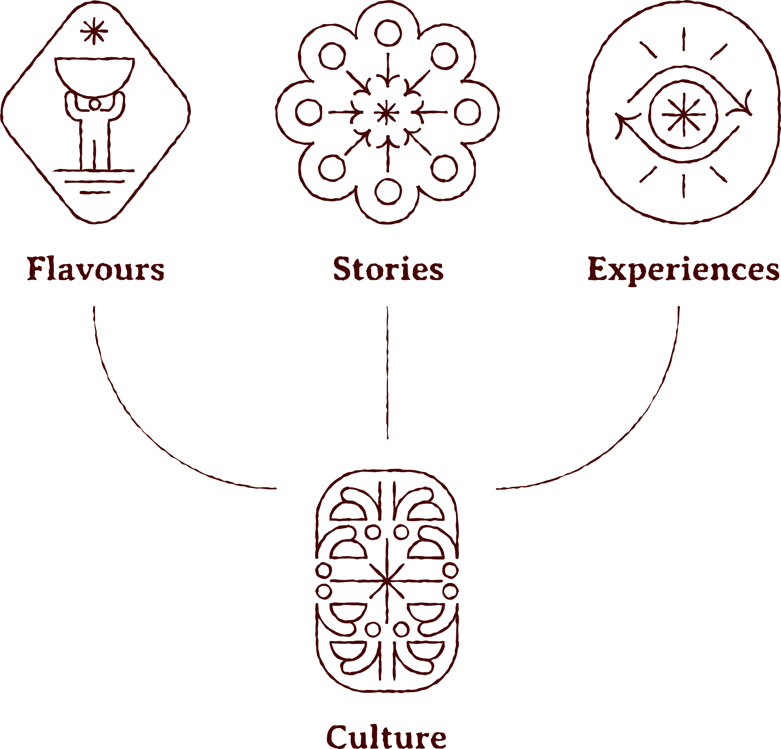
These icons helped to clearly categorise the venue’s offering to create a comprehensive passport-inspired loyalty scheme to draw guests back in.
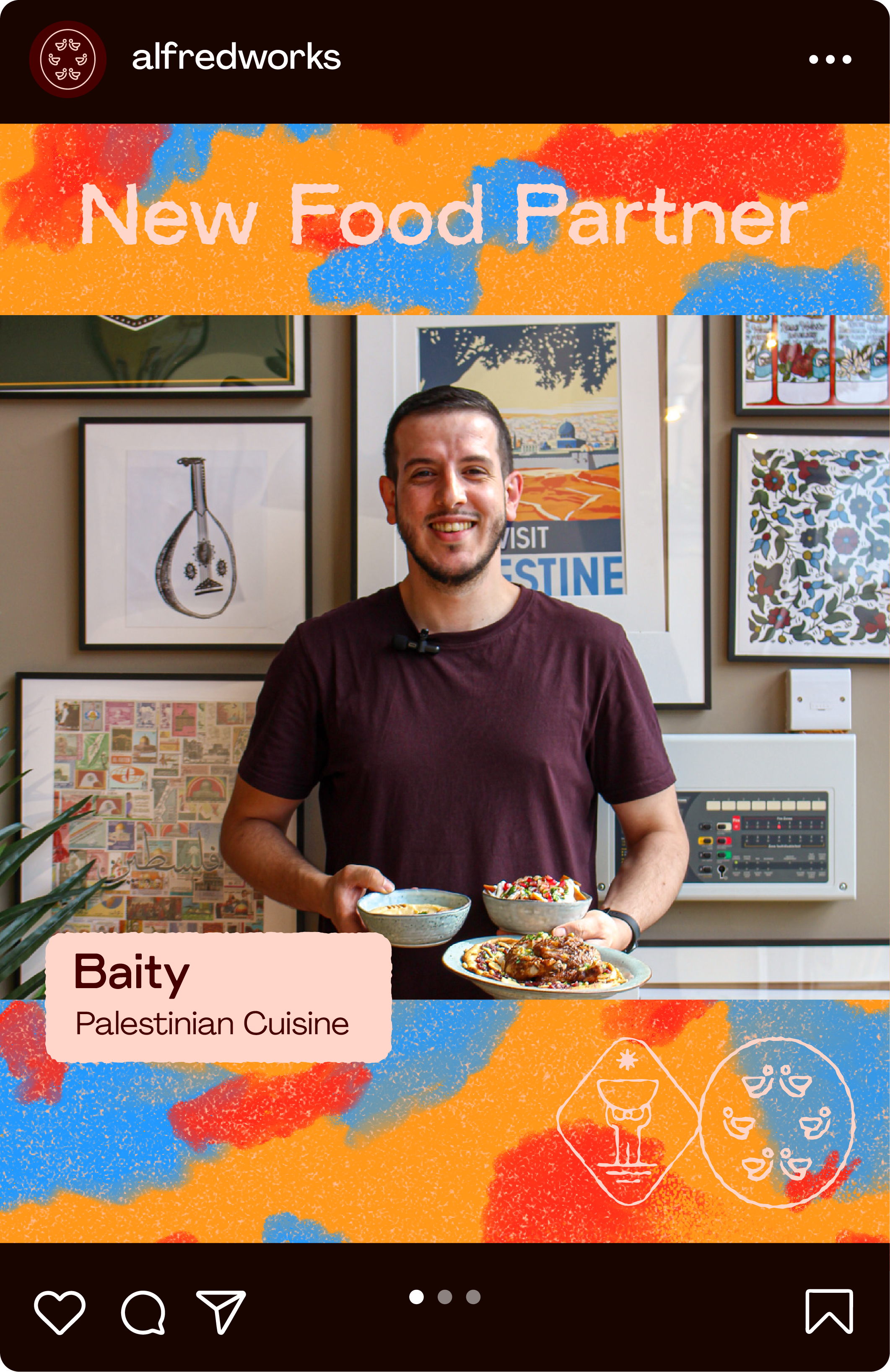
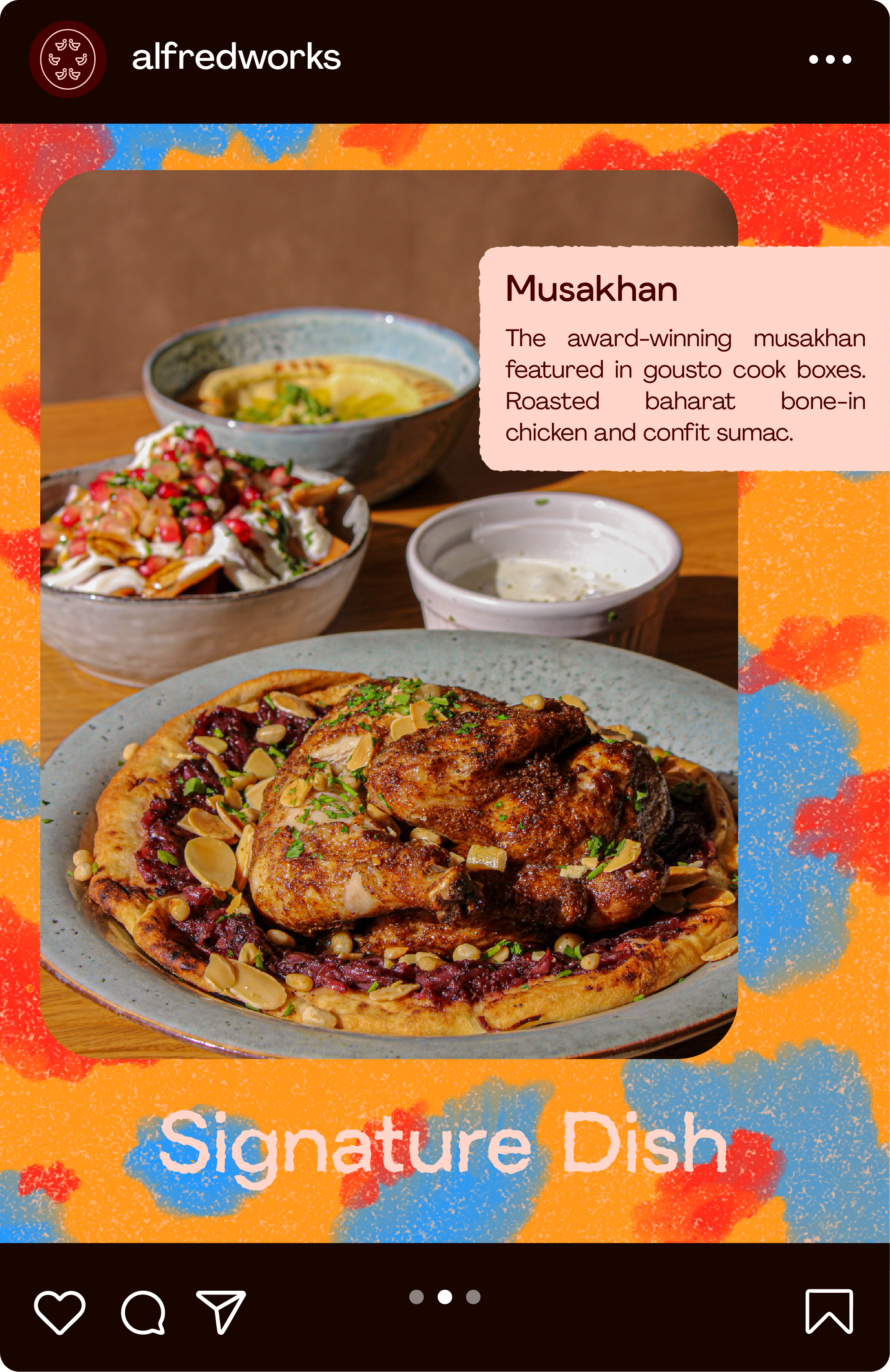
A 52 page newspaper was produced pre-launch, containing info on the venue’s opening, alongside personal profiles for each of the vendors. Featuring each vendor helped highlight that the venue was an incubator for independent business, whilst showcasing the variety on offer, encouraging guests to return to try more… or sample multiple vendors’ dishes in one sitting.
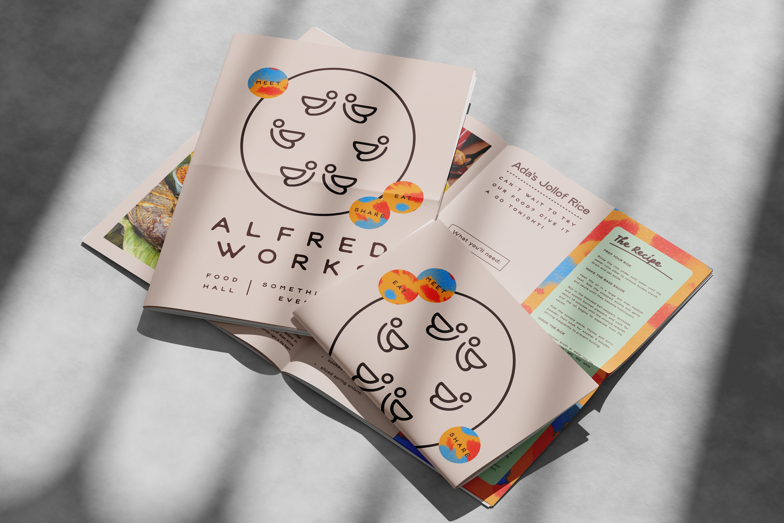
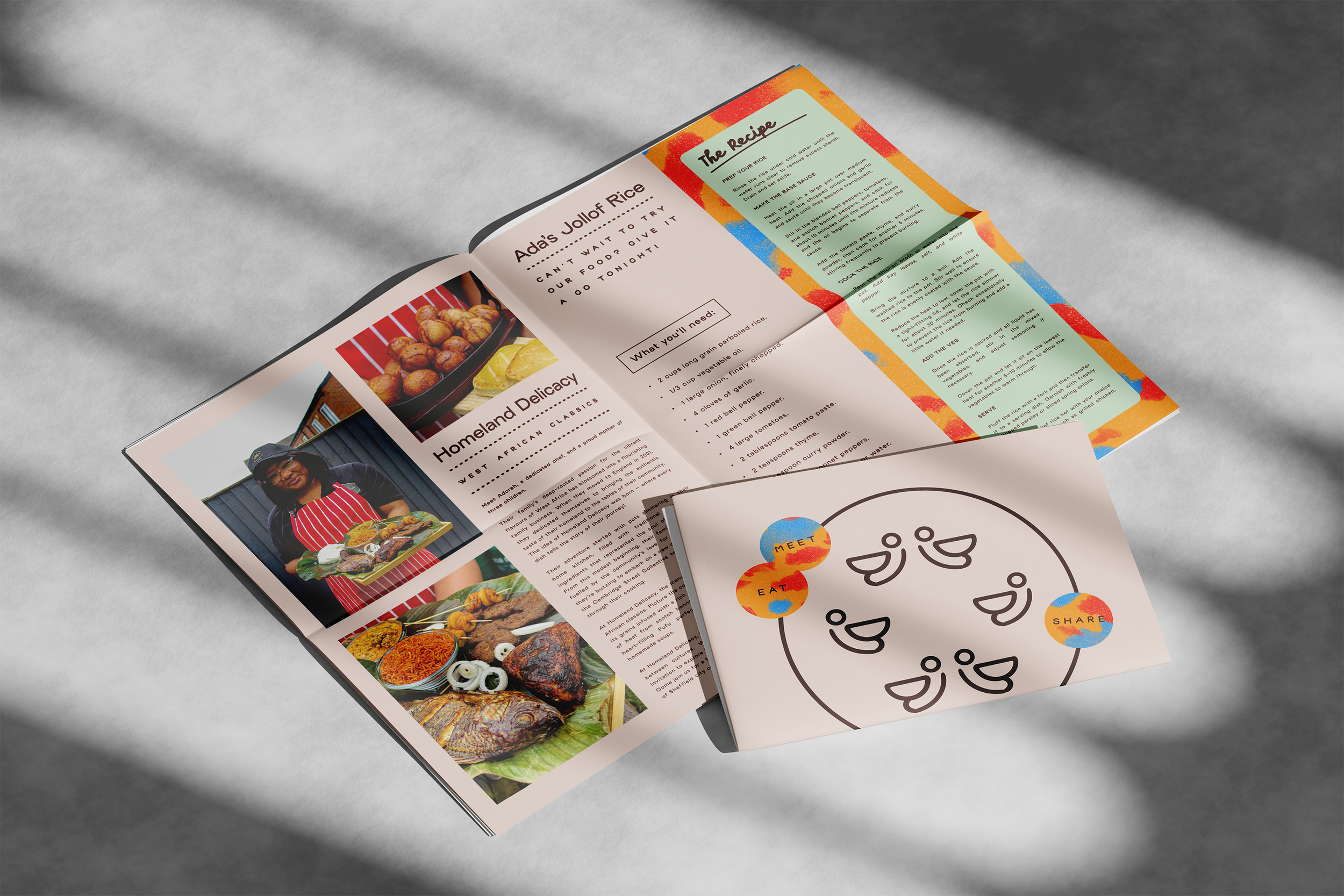
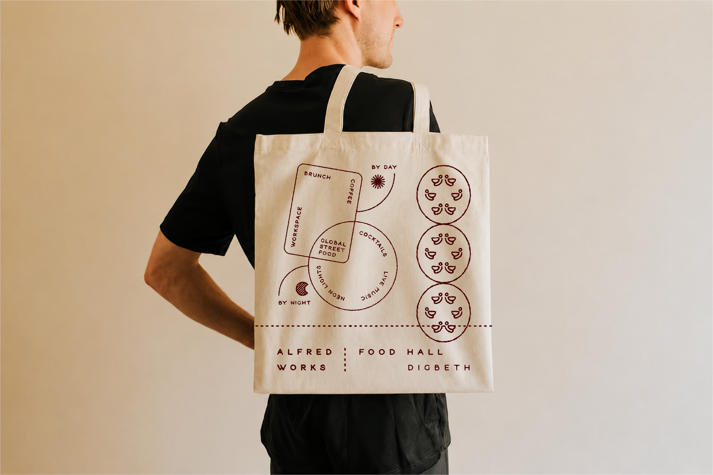
The newspapers were packaged up to be handed out during the launch night, tucked inside custom tote bags alongside vouchers and other gifts.
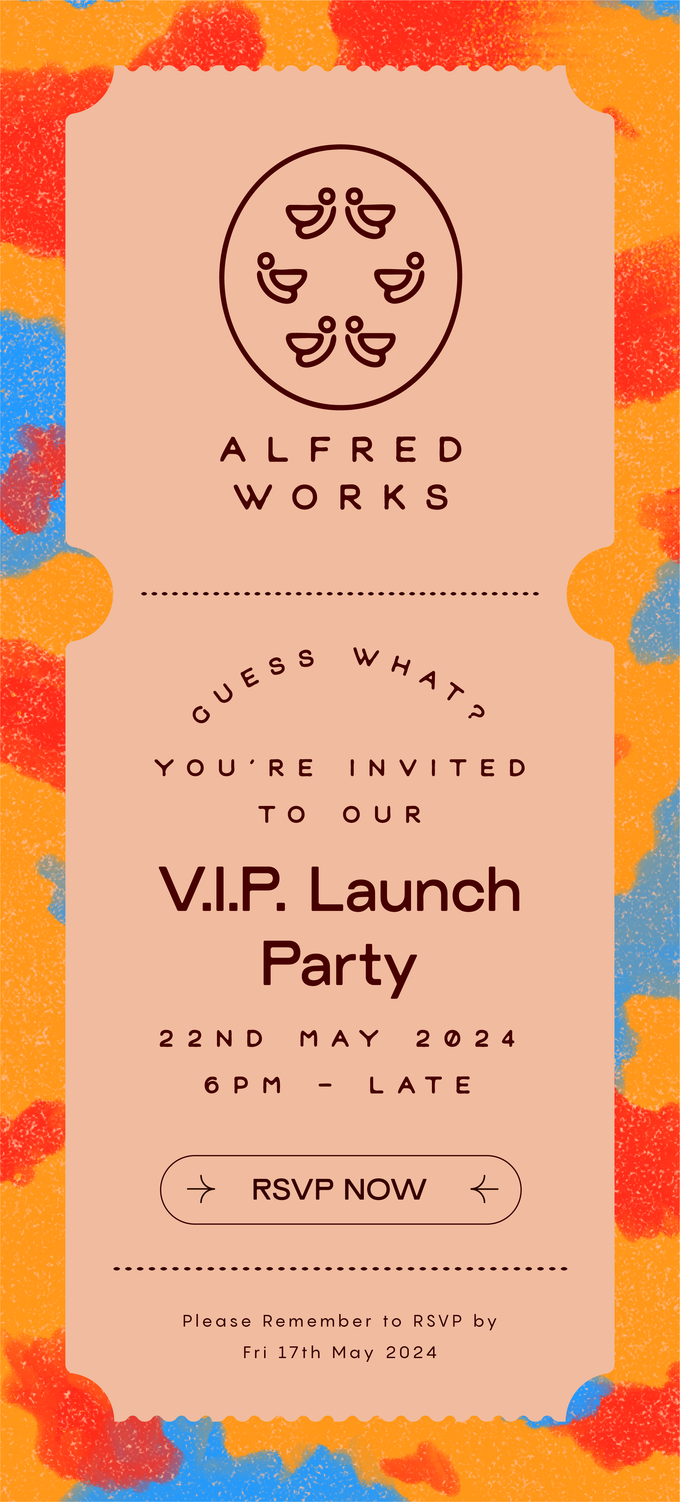
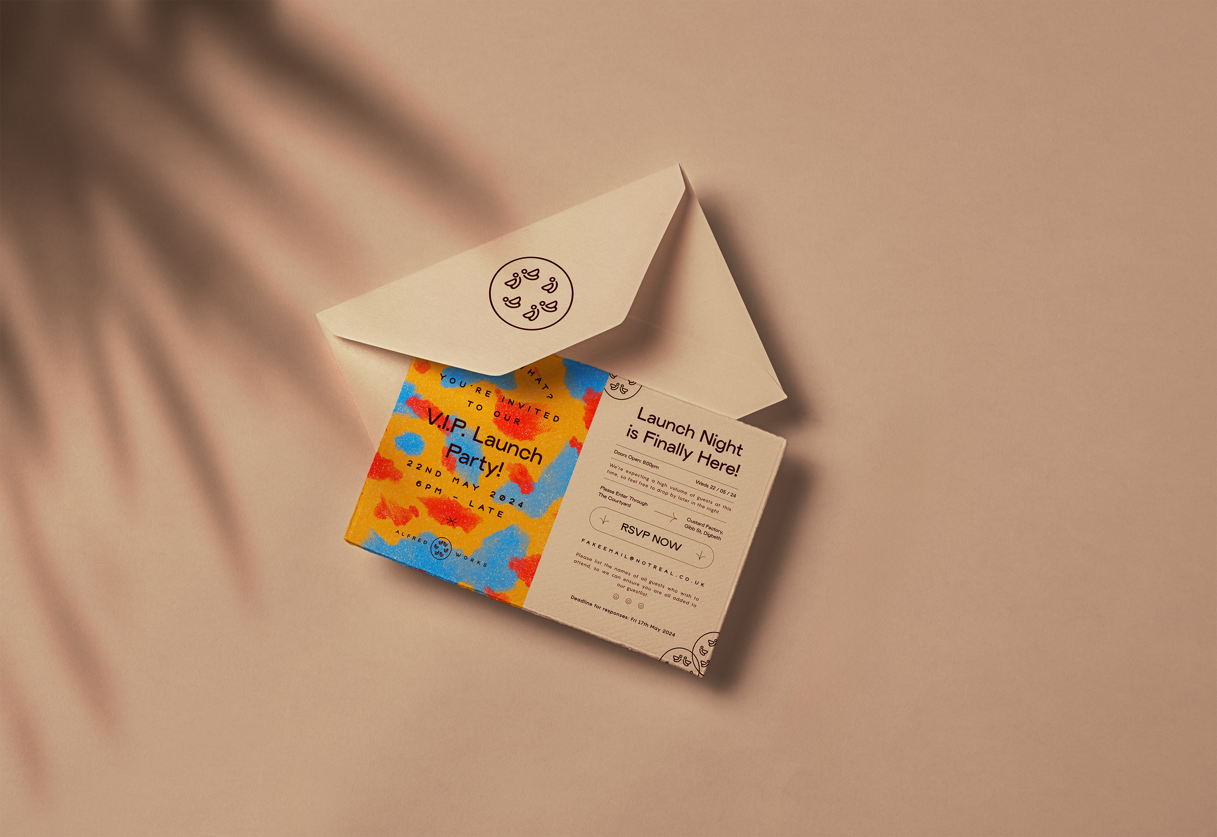
Both physical and digital invites were sent out in advance to widen the reach of the launch campaign, resulting in a full house on the night.
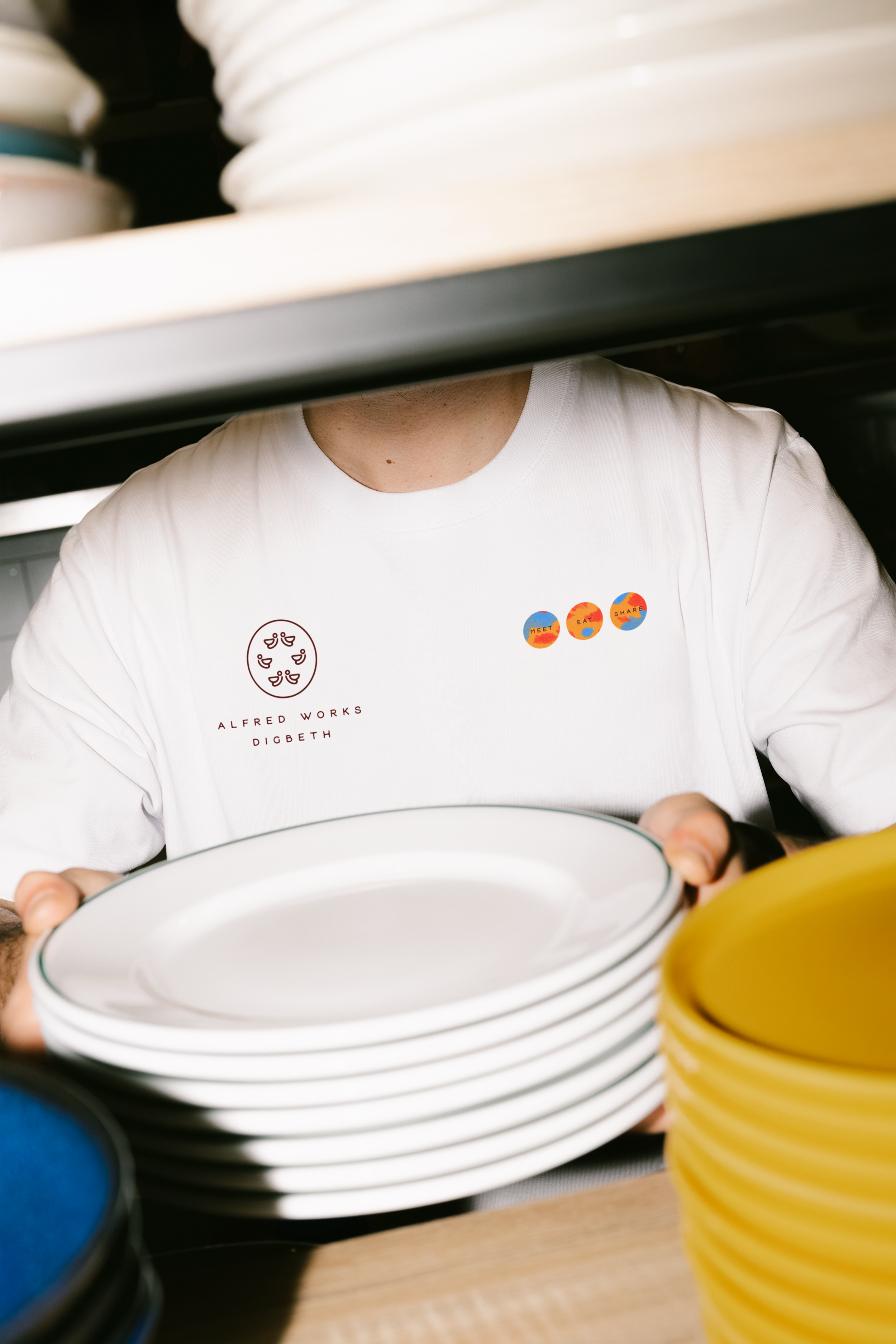
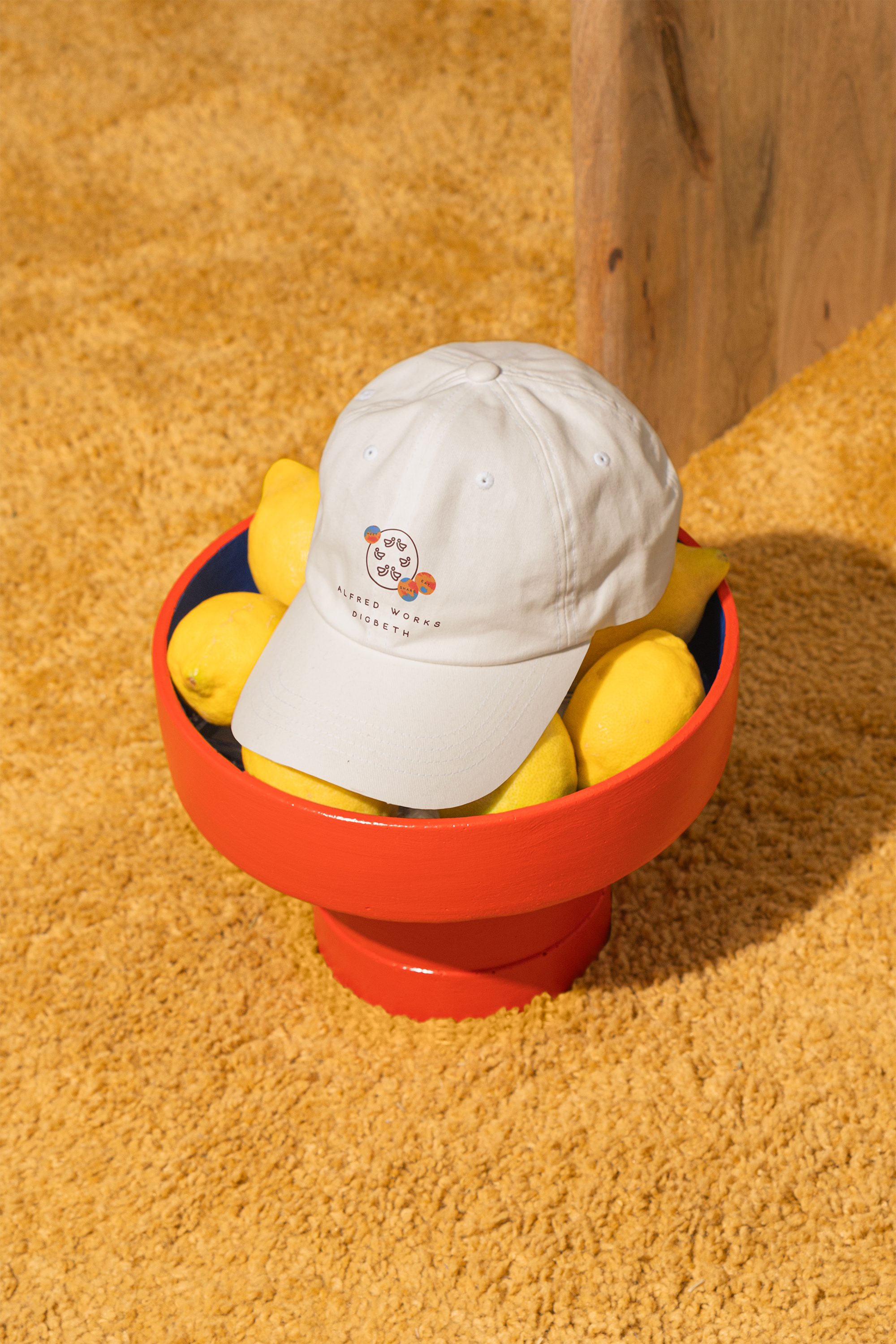
The fairly casual workwear for staff meant uniforms could double up as merch available to guests.
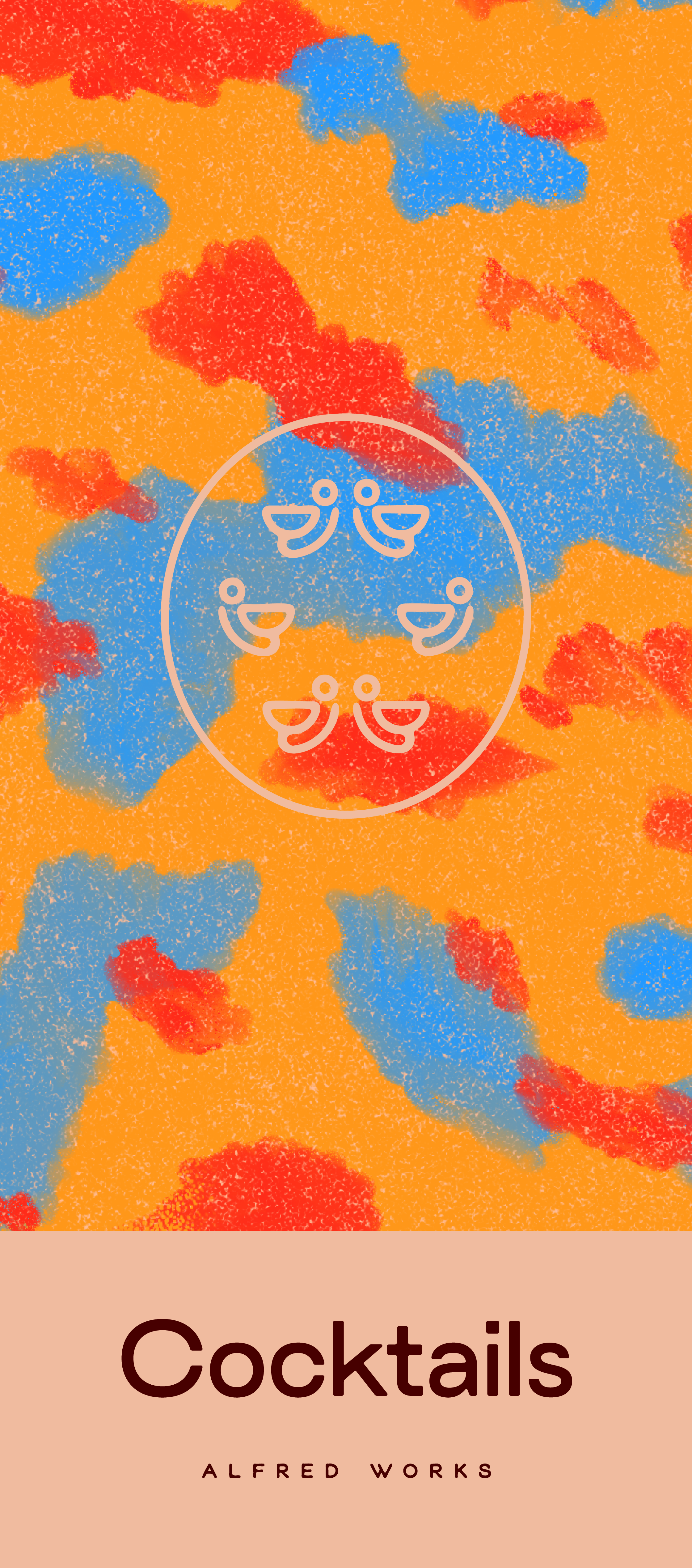
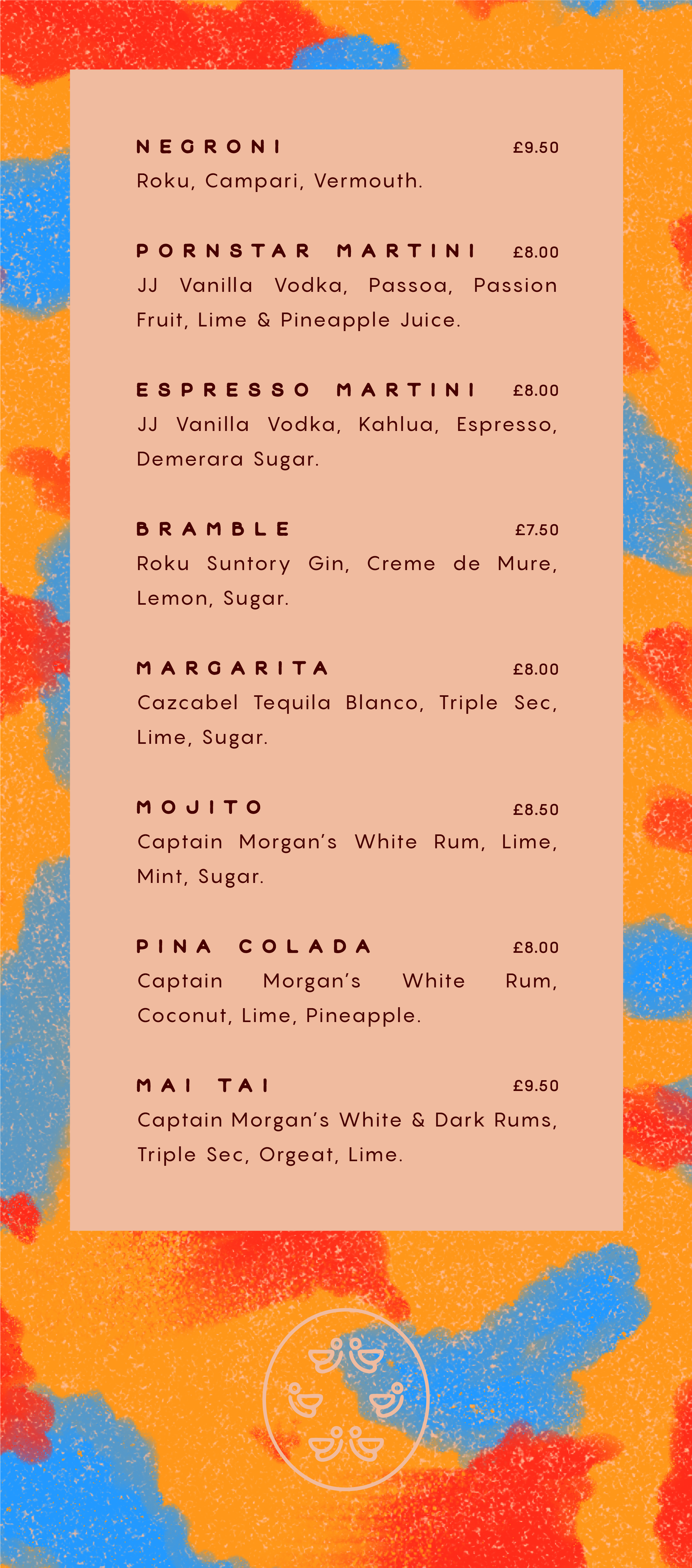
All functional materials were created to be eye-catching but minimal in terms of content; contrasting the vibrant flair of the abstract backdrops with sleek, well-spaced type on flat duotone blocks. With constantly changing menus, P.O.S. and promotions, it was important that the identity to was easy for the team on-site to replicate whilst remaining bold and distinctive.